This blue is another one of my free Ulta polishes, called Mint Condition. Doesn't look very minty, but it's pretty perfect for spring!
I was trying to decide if I should just leave the blue... but I couldn't! I decided to give the China Glaze Luxe & Lush another shot. Up to this point I'd had zero luck with it. BUT! As I suspected, it works really well with blues!!
Tomorrow I might add in a white tip... we shall see!
Showing posts with label The Hunger Games. Show all posts
Sunday, March 25, 2012
Friday, March 23, 2012
The Hunger Games: Stone Cold & Luxe and Lush
This is the LAST of the Hunger Games swatches. I combined the last two into one post, because one of them isn't really a color... You'll see.
First we have Stone Cold, inspired by District 2's Masonry. [Or Joined at the Seam, inspired by the Seam.] If you can't tell, this is a matte. I was pretty skeptical, since I have yet to find a matte I like. But this one was cute! It actually really looked like concrete or something. However, it was a little difficult to apply, since mattes kinda clump and dry fast.

First we have Stone Cold, inspired by District 2's Masonry. [Or Joined at the Seam, inspired by the Seam.] If you can't tell, this is a matte. I was pretty skeptical, since I have yet to find a matte I like. But this one was cute! It actually really looked like concrete or something. However, it was a little difficult to apply, since mattes kinda clump and dry fast.
The second color was Luxe and Lush, inspired by District 1.. because it's luxurious..? [Or Flaming Gems, inspired by Katniss's interview dress.] The preview of this color has it over a light blue, and it looks really pretty. I could not get it to look pretty. I've actually used it over a bunch of colors so far. It looks really good in the bottle, but it's like a glue blob filled with glitter. I have yet to get it to look decent... So here's some trash to look at.
The Hunger Games: Hook and Line
Despite these pictures looking sad, I actually really liked this color. Usually greys look a little weird, but this one had swirly bits of coolio. Here we have Hook and Line, inspired by the fishing industry of District 4. [Or Coal Hearted, inspired by District 12.] Chch-ch-ch-ch ch-check it out!*
I totally smudged a few as I was taking pictures. I guess that's what I get for trying to rush things!
*Throwback to the Beastie Boys
I totally smudged a few as I was taking pictures. I guess that's what I get for trying to rush things!
*Throwback to the Beastie Boys
Thursday, March 22, 2012
The Hunger Games: Electrify
I'm really excited about this color!! I've been trying to save it for last, since it's totally the most awesome, but I just can't. This color is Electrify, inspired by District 5's power production. [Or Heat of the Moment, inspired by Katniss and Peeta's costumes they wear into the Arena.]
I didn't put this polish over anything, but unlike most other glitters, this one was ok without a base color. But putting it over a red, gold, or black would look awesome.
Saturday, March 10, 2012
The Hunger Games: Mahogany Magic
Yikes! Sorry this has taken so long! I took these pictures eons ago, but then I went out of town for forever and a half. My bad, homies.
My pictures do not do this color justice. It looks a little more red-brown, for sure. This color is Mahogany Magic, representing the lumber industry of District 7. [Or Baker's Son, inspired by Peeta.] Different lighting definitely helps this color out, but it's not my favorite... I think I'm too pale to wear it...
Friday, March 9, 2012
The Hunger Games: Fast Track
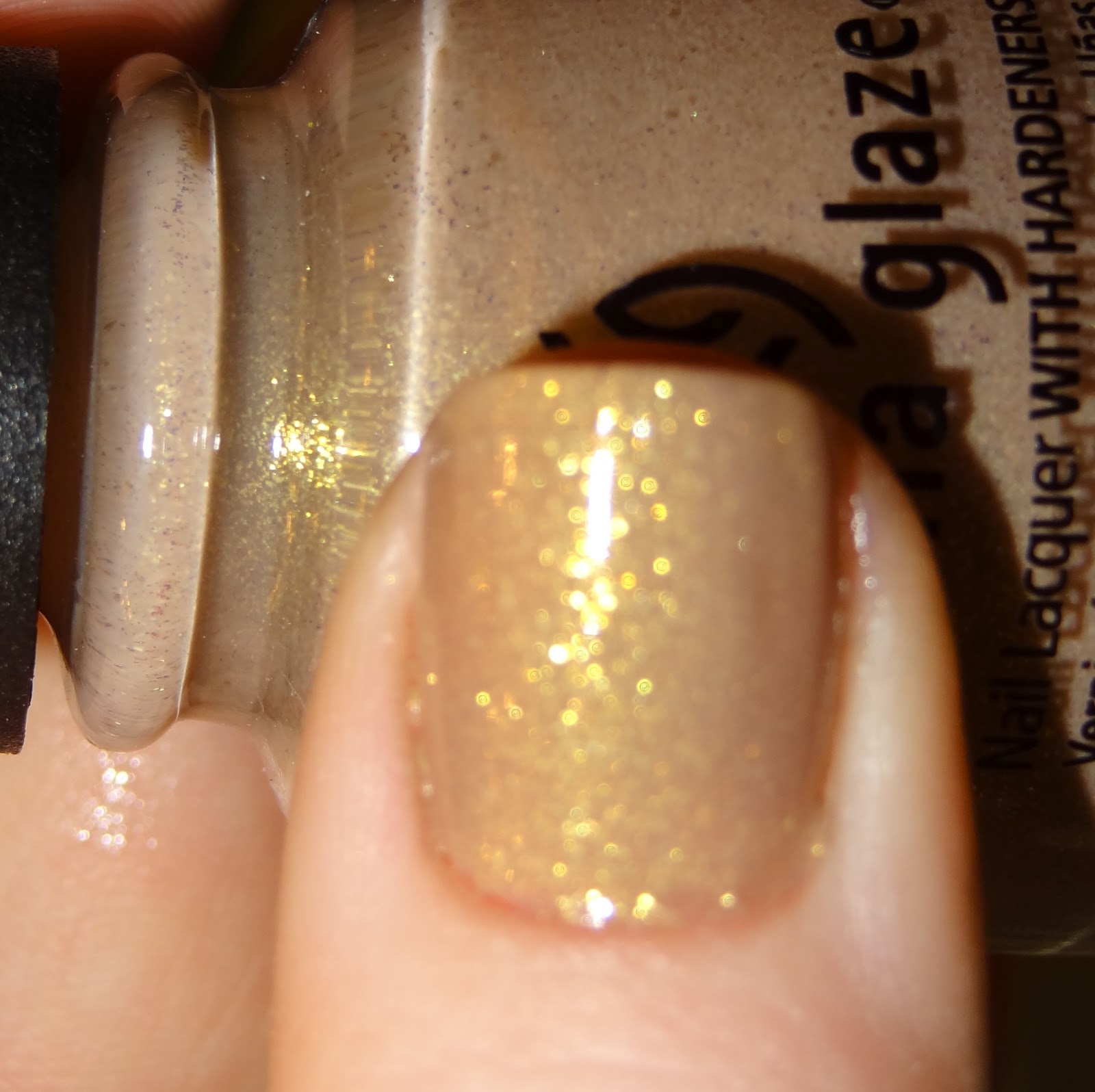
This one only needed one layer! That makes me happy, because I thought it was going to be really thin. This is Fast Track, inspired by the Transportation industry in District 6. Not sure how the color relates though... [Originally this was Catnip, inspired by Katniss. Much better.] This color is... a light beige with flecks of gold. I like it more than I thought I would. Yay!
See? Better than you thought!
| Had to be blurry to see the shimmeries. |
| This is how it looks when you're just chillin inside. Still awesome! |
Thursday, March 8, 2012
The Hunger Games: Smoke & Ashes
Finally! Everyone's favorite district - District 12! Obviously, this represents the mining industry in District 12. [Or Joined At The Seam, inspired by the Seam. Pretty much the same thing.] Last post I complained about how it was difficult to take pictures of Riveting. This one made me eat my words. This was seriously impossible to get a good picture of. And I don't feel so bad, since the other bloggers I've seen reviewing this color are having the same issues. Teehee. This black is accented with shimmery specks of blue and green, which is pretty unique and awesome! If only you could see it... Trust me, this looks way better in person.
I would like to take this moment to blame the quality of these pics on the fact that I took a picture of my right hand with my left. Blame, blame, blame.
| Shimmerrrrrs |
| Best pic. Still hard to see the green though.. |
I would like to take this moment to blame the quality of these pics on the fact that I took a picture of my right hand with my left. Blame, blame, blame.
Wednesday, March 7, 2012
The Hunger Games: Riveting
Another really bright, shimmery color! This is Riveting, based on the Technology industry in District 3. [Or Fire in Flight, inspired by the Flaming Mockingjay.] This one is pretty thin, so it needed at least 2 coats. Which isn't really a big deal. It was REALLY hard to get a decent picture of this color. At least I thought it was at the time. I took pictures on two different days, so between each of them I got some decent stuff. I feel like these look a little bit redder than it actually is. It's a little more orange...
Crazy color!! Although it's hard to describe and difficult to take a picture of, I still like it :]
| Shimmery! |
| I took this one inside... magically it came out closer to the right color. I think. This color plays tricks on your mind. |
Crazy color!! Although it's hard to describe and difficult to take a picture of, I still like it :]
The Hunger Games: Dress Me Up
This color really reminds me of something... I think I had a lacy pink shirt that looked like this! I wonder what happened to it...
Anyways, this color is Dress Me Up, inspired by the textile business in District 8. [Originally this was Primrose, inspired by Prim. Much cuter.] This one was a little clumpy to put on (maybe it's just China Glaze?) but once I put the top coat on, it looked great.
Tuesday, March 6, 2012
The Hunger Games: Foie Gras
I really like this color! It'll go well with the dark nail craze. Today's color is Foie Gras, inspired by District 10, which is known for livestock. [Originally this was Rebel, inspired by Gale being a badass.] This name change is a bit of a stretch, if you ask me... I actually looked up what foie gras was. I had heard of it, but didn't really know what it was. Turns out that was a blessing!! Foie gras is French for "fat liver" - this is made of the liver or a duck or a goose, which is "fattened" by force-feeding the bird corn. WHAT??!!! *vomit*
Monday, March 5, 2012
The Hunger Games: Harvest Moon
I have no order for how I'm going through these polishes... The second one I tried out was Harvest Moon, inspired by District 9, which produces grain. [Or Cinna-mon, inspired by Cinna's signature eyeliner.] I really like this color! It's a coppery gold foil, and it was a lot easier to apply than the first one.
This color is so blingy!! Can't wait to try the next one!!
| Sunlight. Hard pic to take, since they shined REALLY bright! |
| Shade. |
| Best pic of this color. |
Subscribe to:
Posts (Atom)